
This image is generated using Dall-EPrompt: Generate an image of a phone with material design components on the screen in a minimalistic flat style
Now that we have decoupled our UI from the logic, it’s time to do something about the look and feel of our app. Right now it’s an ugly app with just some basic text on a white background.
However, because right now our app only consists of text, we’ll be adding a button in this blogpost to actually see the changes that Material Design brings. Because the text will look pretty much the same, but a button will have a background color.
Add the Material Design dependencies
Inside the build.gradle.kts in the app module, we’ll need to add a dependency for Material Design. Inside the dependencies block remove the old androidx.compose.foundation:foundation dependency and replace it with androidx.compose.material3:material3.
1
2
3
4
5
6
7
8
9
dependencies {
    // ...

    // Jetpack compose
    implementation("androidx.activity:activity-compose:1.8.2")
    implementation("androidx.compose.material3:material3") // <- Update this dependency

    // ...
}
Now execute a gradle sync and let’s start updating the UI.
Use a component from Material Design
Let’s update our Main Composable in the main.kt file by replacing the `` with the new Text component from Material Design and adding a Button where we’ll add the on click handler to change our text.
1
2
3
4
5
6
7
8
9
10
11
@Composable
fun Main(
    viewModel: MainViewModel
) {
    Column {
        Text(viewModel.displayText.collectAsState().value)
        Button(onClick = viewModel::updateText) {
            Text("Click me")
        }
    }
}
We’ve wrapped the Text and Button component inside a Column component so the two components we want to display will be displayed below each other instead of on top of each other.
We still see that ugly title bar with My Application, to remove that we’ll need to update our manifest.xml and add the android:theme property to the activity tag.
1
2
3
4
5
6
7
8
9
10
11
12
<!-- ... -->

<activity android:name=".MainActivity"
    android:exported="true"
    android:theme="@android:style/Theme.Light.NoTitleBar">
    <intent-filter>
        <action android:name="android.intent.action.MAIN" />
        <category android:name="android.intent.category.LAUNCHER" />
    </intent-filter>
</activity>

<!-- ... -->
Set the android:theme to @android:style/Theme.Light.NoTitleBar to get a light theme without the title bar, or to @android:style/Theme.Dark.NoTitleBar to get the same result with a dark theme. For this, you’ll need to update the text color of the Text component otherwise it won’t be visible. You can do this by simply passing the color = Color.White parameter to the composable.
Run the application
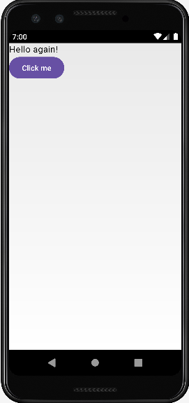
Now that we’ve updated our app with a button and use Material Design, we can run the app. It now displays the same text as before, but with a button using the Material Theme. And, if that’s not all, that ugly title bar is gone as well. Giving us full control over the screen with our own composables. In the following post, we’ll be updating the text to make use of translations when a user has selected a different language than English.
- The entire application can be found on github.com/bartkessels/basic-android-app
- Just the code that’s been created in this post can be found in the tutorial/setup-material-design branch
Categories
Related articles

Set up Jetpack Compose
In Android development, the new standard for building UI's is Jetpack Compose. But how do you actually set ...
Set up View Models with Jetpack Compose
You've just set up Jetpack Compose, but how do you properly separate the UI from the business logic? This i...

Support multiple languages in your app
The user base for your application includes multiple nationalities, so why don't you update your app to all...
Enable UI preview in Android Studio
When developing an Android app, you're likely to iterate through multiple UIs. When going through this proc...